Friday, April 20, 2007

Image Essay # 15


Since we are still working with color and we had the art show today I chose to do a painting that demonstrates analogous colors, which is a piece that combines several colors next to each other on the color wheel. The colors in this piece are violet, red, orange, yellow, green, and blue which is basically all of the color wheel making this a great example of an analogous color scheme. At the art show there were many good demonstrators of color schemes. It was not uncommon to see red and orange in the volcanos (for the lava). In our classes area there were a lot of color schemes in the posters and the dvd cases. There was complimentary colors, some earth tones, and analogous colors. Overall at the art show there was a really good variety of everything even neutral gray, such as in the robot cat. I think this is a very good piece overall because all of the colors define something different. The water is blue while the sky is a lighter hue of blue. The raft is orange, yellow and red and the trees are green. By having all those colors in this piece it is brought together very well.

Wednesday, April 11, 2007

Image Essay # 14


For this weeks image essay I chose to do a Lucian Freud artwork. This painting is a portrait of the queen. I like his work a lot and I think it is because he makes things look so realistic, like a picture would be from a camera. I chose to do one of the artists we were talking about during the color powerpoint because I wanted to make sure that I understood the concept of the colors artists use. I found out this week that color says a whole lot more than I thought it did. I can show a mood or feeling and mindstate, also color brings the painted elements to life. Lucian Freud uses a lot of detail while also using the color to bring it alive. Using color attracts the eye, whether it is dull and sticks out for that reason or it is so bright you cant help but look. Colors are also symbolic, in class when we were looking at Eric Fischel artwork, the chairs were pointed out as having a certain meaning but the color of the chairs is what draws the eye in to than be able to establish that meaning. Color is a very powerful form of expression and I am excited that we are finally working with it.

Friday, April 6, 2007

Image Essay # 13


This image is called Chicago Board of Trade II by Andreas Gursky. I chose to use his work for my image essay today because we talked about him in class yesterday when we were learning about color. We learned that Andreas Gursky uses triadic colors which are any colors the same distance apart on the color wheel. In this piece we can see yellow, orange, blue, purple, green and there are some lighter and darker parts such as black and white sections. I think that having the darker and lighter areas really makes the color stand out. Also there is a foreground, middleground and background. They are not highly defined like there foreground is not as dramatic as it could be but it is there. I like this piece because the colors are so rich and pure that they are bright and each one stands out. I also like this picture because as you get closer the people in the picture become more defined by skin tone and detail but far away everything is defined by a color and it doesnt look so much like a picture anymore but a painting.

Thursday, March 29, 2007

Image Essay # 12


This week I chose to do my image essay about the paper art that Matt Shlian showed us how to do last Friday in the workshop. Even though he could only teach us basic things it was still interesting because the paper that we were making simple pop up cards out of can turn into something completly more extravegant. Making nice sculptures out of paper would be fun, but it just couldnt be fun for me, even though I like his work and I think that it is cool looking, I admire him because I do not have the patience to do something like that at all. One thing I have learned from doing these blogs and looking at artists work, is admirance. A lot of the work the visiting artists I have gone to listen to , have requires patience,desire and a true love for the art they do, it shows. The workshop taught me some new styles of cards and just pop up objects I could have somewhere. It was interesting, and something that I never learned in grade school. What made me so interested in this type of paper artwork, is just knowing it is paper and it still holds itself so well and even though it paper is flat, in the sculptures it is 3-d. It is yet another type of art that I wasnt too familiar with, or really even knew existed.

Thursday, March 22, 2007

Image Essay # 11


This is a picture of Mel Chins Seven Wonders. I chose to do artwork by Mel Chin because I went to the movie film night on tuesday and his work interested me. In the video it really only shows his work having to do with the environment. By researching him more on my own though I have found out that he is more than just an ecological artist, but also a sculpter. The Seven Wonders is located in Sesquicentennial Park. I really like the look of this piece, to me it resembles the eiffle tower seven different times. It is kind of hard to tell on this image but when you get close enough to the gray there are little pictures within it. Even when the image is enlarged on the computer it is still diffucult to tell what exactly it is, but by outlines and such I can distinguish a globe and the outline of a person. I really like Mel Chins work, I think this is so because I didnt know his projects could be considered art, like the revival field or when he dug up the worms and worked with teh SPAWN project. It taught me that art comes in so many different forms, some like I would never expect.

Friday, March 16, 2007

Blog Entry # 5

The Artist I choose to look up was Michael Graves, and I was suprised to find a bunch of information about him and Michael Graves and Associates and Micheal Graves Design Group. Micheal Graves has contributed to the field of interior design in many ways. He is known for things like the Swan and Dolphin hotels in Disney World, which looking at through pictures amaze me. He is also known for the Alexander House, Crooks House, Hanselman House and the Portland Building. He has designed furniture shows and it is said that he would and has drawn anything you could think of. He has also designed things like china and silverware for Alessi, his own home was even featured in the Home and Garden magazine. By reading about him and looking at his work what impresses me the most about him is that when he first started out he had a hard time being noticed. I love to hear stories about people who struggled than made it to the top, just so they can prove everyone wrong. Yet he remains a teacher at Princeton and says that it takes up a lot of time but he did so well and owes something to the university. Micheal Graves uses dominance in different ways. Some of his work is dominent just because of the size and how extravegant it is. While others are dominent in color or materials that he uses. He addresses the human form by making things for the people and making them comfortable to sit in, use or live in. It is suprising but I actually have been influenced by his work, it is very well done and in a unique way. I think that it is something that I will research more on my own time. In his work Micheal Graves uses color that fits what he is working on, making the things he does look more comfortable and inviting. He uses colors and materials that go with what he builds to make the structures appear more natural and appealing.

Wednesday, March 14, 2007

Image Essay # 10


Our new project is called "THE STORY OF THIS PLACE". This is a picture of Wakula Springs Florida, and I visited there when I was younger. Wakula Springs was somewhere my grandpa took my brother and I. It was the most interesting place I had been to at that time in my life because the whole idea is to take boat rides through the reserve. The first is a boat ride with a clear floor so you can enjoy all the fish underneath and yet still see the animals that live above the water. Wakula Springs is known for its alligators. They are everywhere! It is not a bad thing mainly because living in Ohio my whole life I had never seen one before, it was amazing to see so many at one time and it is a moment that I will never forget. The second boat ride is called the safari ride where the passengers go through a more swampy area, still seeing the same animals it just gets more upclose and goes through a different part of the reserve. This picture is memorable because it still rates up there with places that I have been before and is one of the most beautiful places I have ever had the chance to visit.

Sunday, March 11, 2007

Image Essay # 9


I choose this piece of artwork by Pepon Osorio because I really like the way he turned a bicycle into so much more. It becomes very eye catching and and all the extras on the bike look like symbols to make one big thing. In the video we watched Pepon said that he embraces contradiction, and to me this bike contradicts itself in many ways. It is so unordinary and I think that is why I like it so much. Pepon also stated that he recreates memory and sacred spaces and that makes me think this bike might have quite a bit of meaning to him when he was young. Usually his work provides an uncomfortable reaction, many of his art setups left people in the video cringing and this piece actually makes me smile because it is bright, shows no blood or caution tape like his displays did in the video. I also chose this piece to do an image essay on because it is so different than what we had seen in class that I would have not known he was the artist when I first looked at it.

Thursday, March 1, 2007

Image Essay # 8


I choose to do this my image essay this week on one of Richard Serras art pieces. I had not heard of him before the video we watched during class, but after I saw what he could do I instantly liked his work. I think what I like best about his art work is the scale of it compared to people. It is easy to see in this photograph how large the object is compared to the person coming out of it. I also like value of the colors that he uses they are very subtle and I think that they help give his work a better look and feel. I also like that his work has nothing to do with what normal people recognize. It might just be me, but by doing that it makes people curious about his work, maybe more than just a painting or photograph. I also like that the texture of it is smooth, because even though it is smooth, when the light is on the copper certain ways, it is given a different color and in one sense a different texture. One other thing I like a lot about his work is that instead of just looking at it, there can be a hands on feel of the work.

Friday, February 23, 2007

Blog Entry # 4

ART: 21 - Place
1. First we define a place, than a place defines us.
2. Richard Serra is influenced and inspired by ships. Sally Mann is inspired by ambiguity and mostly she said that what ever she is surrounded by is what she takes pictures of. Margaret Kilagllan was inspired by American and Indian folkart. Barry McGee is inspired by a football field, folklore also and he likes freedom.
3. All places can look different just like homes but just because they are different forms they can mean the same thing just to a different person. Different places have different faces and the video showed how art can look different and how some people come across it can be different also, an example is that the grafiti on the side of buildings can be seen to anyone walking by, but art in galleries has to be inquired, people have to make time to go and look at it.
4. I think that I feel most connected with Richard because he likes to use scale and makes things memorable for all the people that see them. I don’t think that I could personally be a good artist like him but I feel more connected to him than the other artists because his art is something I would go to see in a showcase or gallery.
5. Richard uses many people to help him put his work together, especially because he uses steel he has really good media attention, in the video it looked like there were field trips looking at his work. Sally did everything for herself, she took and developed the pictures (of course with the help of her family), I am not sure of what type of media attention she gets because the video never really specified where her work could be seen. Margaret and Barry’s work were shown in the video, while they were setting up, otherwise it seems like they do work for free, they painted on the side of trains and Barry grafittied on the sides of buildings and explained just how much he liked freedom in general.
6. I liked the Mall, it was mysterious because it was so big. I was scared of my basement, because it is dark. I liked my room because it intrigued me. I liked the lake behind my house because there was always something to do back there. Escalators I was defiantly scared of because I thought they would "eat me".
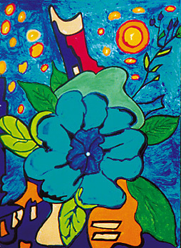
7. My room was occupied by stuffed animals, posters, pictures of family, I had a bunk bed for when my friends came over, a desk and a radio with a vtech laptop. The lighting was really good in my room, my window was huge and when you opened it, it was possible to crawl out onto the top of the roof and just sit there (at night it was the best place for the stars), it was always a happy place. The textures of my room were really no different than any others, the carpet was soft and thick (and pink) the walls were just painted white and most of my stuffed animals were squishy, some hard, others wore clothes that had corduroy on them. The radio and desk were hard, one was wood and the other was made of plastic.
ART: 21- Stories
1. Some important stories we hear are defiantly by older family members, like grandparents etc. sometimes it is hard to understand how they lived while they were younger but the stories at least create a picture in the persons head. Books and movies also provide us with stories mostly stories that make our senses and imaginations go crazy, in action movies/books you are always on the edge of your seat, in horror movies/books the heart beats so quickly, when it comes to sad and romantic things usually crying or feeling sympathetic for the character is a common feeling. The news also tells us stories, more recent and new coming though, sometimes they are things we don’t want to hear so we pretend that they cant possibly be happening. Music stories usually tell of child hood memories, or some experience in that persons life. I could not pick out one story that would be passed down, there are so many funny stories and memories that I am sure at some point will all be told when the time is right.
2. Sometimes people want to forget the terrible things that happened to them, terrible meaning that there is no way you could look back on that and laugh and oppose to something like falling down the stairs and looking like an idiot. Happy memories are usually the most appropriate they can be an any occasions laugh whereas the other stories might actually ruin the moment of happiness.
3. I think the artists used their sketch books more for ideas than anything throughout the video I noticed that Kiki for instance used larger scale paper etc, to make practice drawings and get ideas like how she cut out the silhouettes. A journal or sketchbook could defiantly be considered a work of art because it shows ideas and sketches even though minuscule examples it can still be art, a piece of artwork or a painting doesn’t have to be life size or huge, because it is not at all the size but the meaning.
4. While living at my old house my favorite thing to do was go fishing in the lake we had behind the house. It was fairly small but the fish catches were always impressive. One morning I was wearing my bathing suit and I wanted to go fishing so I headed out. The happiness was short lived because (I am not entirely sure how it happened anymore but) I fell into the lake and landed on something sharp, when I stood up I was in shock and for the second I didn’t feel terrible pain I stood up and saw bones in my leg. Blood rushed out of my leg as soon as I was out of the water and of course I started screaming and crying, my mom took me to the emergency room where I received many shots (because who knows how dirty that lake really is, and we had no idea what I fell on to begin with) and internal and external stitches. For weeks I had to sit with my leg up and if there was something I wanted to do my leg had to stay completely straight so I didn’t rip or break the stitches. I remember feeling sorry for myself because I could not go out and swim or fish like everyone else and it was summer so no one really wanted to just sit with me while there was so many other things to do. When I look back on it I realize that I was being stubborn, I fought my mom to not take me to the emergency room and ruined some of her towels I the process (because I was bleeding so badly). Also I should have understood more why people couldn’t sit with me and that they did have other things to do, instead of whining and making them feel bad. Overall it taught me to be more careful and not to argue with someone older because either way they are going to win and I had to go to the emergency room.

Tuesday, February 20, 2007

Image Essay # 7


I choose this picture because today in class, while we were critiquing I finally learned and understood gray scale. I was getting really mad at myself for not understanding what I was doing wrong and I couldnt figure out why I was having trouble, but than you said that everyone learns at different paces and rates, and after I let myself just relax for a second, I realized I knew what the gray scale was about. Although this picture of the flower may not be exactly what we are going for in this project, it does have the gray scale, the biggest flower is symmetrical on both sides and much of the picture contains different types of texture. Another reason is because to me this picture represents understanding, I now understand what it is the gray scale is and I am learning how to use it. In this picture there is definatly closure and repetition because all the flower petals have the same texture and design and yet only all of them together make the 'whole' that the flower is. The flower also has proximity because the flower for the most part does have common edges and all meets in the center. The flower most importantly has meaning and I create would be the word I would use to describe it because today in class and understanding was created by reviewing materials and taking time out to think.

Sunday, February 18, 2007

Image Essay # 6


This past week in class we learned and made new types of texture. We also touched on the topic of focal points in art pieces. This artwork is a good example of what we are working on in class because it is an all textured picture which also contains a focal point, and also works with little color (as are we). The texture in this piece is what makes the focal point not so much an object. In my opinion I can see this picture as being related to water, like when the tide comes in and washes away some sand. Yet if you can get close enough you can notice little red parts in between some of the crevaces which close up can make those a possible focal point, but from far away it remains the same. Also in this picture there is many different types of texture, for the most part no two are the same, there is a smooth one at the bottom, than a rough one to the left and than it smoothes out again, showing how many different textures there are. And although there is no real image visible in the picture the eye is still lead around the picture, which makes it one last reason it is a good example of what we were working on this week.

Tuesday, February 6, 2007

Image Essay # 5


This mosaic is a good example of what we are talking about in class this week. Not only does it have a good looking texture that makes me want to reach out and feel it but it also can fit into the six principles of Gestalt. The mosaic has good coloring and I think that the shapes in it make the piece interesting. Although the design goes off of the page your eye is still lead around it because the background changes colors and the spirals inside of the design makes your eye go to it therefore it has good movement. There is no real symmetry in it but the bottom two designs have a good proximaty between them. In the piece there is also closure, even though it is very apparent that the parts could not fit together as they are, it is almost as if a person could reach into it and move the pieces to make them fit together. Overall it seems like a very playful piece in a way because it does contain many of the principles of Gestalt and has good color scheme and pattern and keeps the eye interested in looking at it.

Blog Entry # 3

Before this Blog Assignment, had you ever kept a journal, diary, or blog?
Yes
Before this Blog Assignment, had you ever written about art before?
Never
Have you ever written for fun (poetry, fiction or non, journalistic, or research)?
Often
When writing, do you use a dictionary or thesaurus?
Dictionary
If given a chance, would you rather discuss art verbally or through written means?
Written
How would you rate your overall vocabulary?
Average
How would you rate your vocabulary of art terminology?
Average
How would you rate your writing abilities?
Confident
How would you rate your writing abilities when writing about art?
Average
How would you rate your ability to use specific vocabulary when writing?
Average

Friday, February 2, 2007

Image Essay # 4


I chose a picture of a rainbow because on Thursday we talked about symbols and what they mean. Sometimes symbols may not be as easily known or seen such as this one. But there is quite a bit of meaning behind the idea of a rainbow. Some people look at it as hope becasue it means that they have endured the rain and good times are on the way. Others take each individual color and have seperate meanings for them. Some may also take the whole rainbow and define themselves by it, what ever the case it is always a beautiful sight. One of the best things about a rainbow is that it shows unity using a variety of different colors that otherwise might not go together well. The color value of the violet and blue is very strong.

Saturday, January 27, 2007

Image Essay # 3


I think that this picture is a good e xample of the things we are focusing on in class this week. First of all it has tension in it, I believe it is the eye of the tornado because behind it there is lightning and darker weather. The clouds also represent dominance basically you can tell that the clouds could over take the house at any time. The picture also contains perspective, where we can look straight back and see the storm has not yet reached the house. Also, this week we have been focusing on senses particularly smelling and hearing, in this case you can do both. Storms have a distinct smell to me there is a certain odor in the air before and after they strike. The sounds can also be before and after when it comes to a storm. This picture is also a good example of what we are working on in class because by looking at this picture many different ideas of smells and sounds come to mind.

Friday, January 19, 2007

Image Essay #2


I think that this picture is a good example of what we are currently doing in class. To me this composition represents tension. All of the lines go off of the page, breaking the picture plane and look as if they are all pulling at a constant strength making the tension in the middle of the composition. The middle of the picture (where the tension is) also looks like there are contour lines, which makes sense because people are three dimensional and the lines make it so you can kind of see more of the back of the person and it looks like the whole picture is than more three dimensional. I also think that this picture can represent synesthesia because when looking at it, I see pain in that person and I also feel it. Also, this compostion is dramatic and the tension in the middle is very dominent but there is also dominent negative space to the right of it.

Thursday, January 18, 2007

Blog Entry # 2

When I chose images for my part three composition I honestly did not take into consideration what it would look like when I juxaposed them. Mostly I picked images of things that I personally liked, basketball, reading magazines and palm trees. I did work on the orientation of the objects for a while though and found that to me it looked the best when the dominent basketball on the paper was the center of attention and working around that I tried to make the smaller subdominent basketballs lead the eye around the page to the accents and negative space at the bottom. I did run into trouble with the objects I used because they were not small enough to be good accents (magazines) and by making them smaller it was harder to tell what they were, and with the palm trees it was also hard to make them skinny lines because the tops of the trees are not exactly straight. Basically my objects do not make a story of some kind they are just likes of mine.

Sunday, January 14, 2007

Image Essay #1


I think that this image is a good example of some of the things we are doing in class this week. The larger image of the flower in the middle is dominant it also bring the viewers eyes right to it and behind it are accent shapes and sizes. I also believe the flower is blue to show dominance because most of the picture is. The orientation of the image is also good because it does not make your eyes run off of the page at all the color of the sun and other circles keeps you interested along with the object behind the flower. The image leaves no room for any real negative shape, also just like in class the spacing between each object is different and not symetrical. The leaves on the branch are the subordinate objects because there are only a few of them and they are small. Overall the shapes, sizes and colors make this a good composition.

Wednesday, January 10, 2007

Blog Entry #1

In high school I took only two art classes, crafts one and two. Those two classes were what I looked forward to everyday. Because I took those classes as an upperclassman we were able to have open studios and do what ever we wanted to, a lot of times my ideas would come from things I was thinking about whether I was mad or happy. Most of the time I would do some scenery art, like painting pictures of the ocean with palm trees or make collages, other times depending on what the season was I would do things like weave baskets (with coil or cardboard) make gingerbread houses, and once I tried to make paper. I would say that under most conditions I work very well and when I do something that I like to be doing especially in art form, but sometimes I do get discouraged. Being in a crafts class there was so many different types of artists all around me that it got frustrating at some points because I did compare myself a lot to other people and how well they were doing as oppose to me. I like art very much it gives me a way to express myself, I do recognize though that I have some weaknesses in it, and I may not be as good as someone else but I put my all into something so I cant be too hard on myself.

My major is Interior Design and it requires me to take 2-d foundations, I know that sounds as if I am only in it because I have to be but I planned to take at least one art class every year I am in school because as long as I am doing something I like art is like a release to me and it really does help me feel less stressed about things that could be going on in my life. The only downfall I see in any of it is that someone may look at what I am doing and not think it is good enough or wonder why I am even in the class because I am not all that good at art, the truth is that it is just something I like to do and that is why I know that I am going to try hard in it.